In previous articles, we've shown you what MakerPlot can do right out of the box. Now, we're going to show you what MakerPlot can become in your hands because we're going to give you all the tools you'll need to construct whatever GUI you want in order to capture, plot, log, and manipulate your micro's analog and digital data.
This is the first in a series of articles on how to customize MakerPlot. By its very name, MakerPlot hints at this customization feature and, of course, that’s why we call it “The DIY Software Kit.” Unlike most hardware kits that have only one or maybe two primary functions, MakerPlot is an open-ended software GUI that has no practical limits in terms of what can be built.
As always, if you haven’t already done so, you can download a free 30 day trial copy of MakerPlot from www.makerplot.com to follow along. If you like what you see and what it does, you can order it from the NV Webstore at a discounted price. Let’s get going.
Interface Basics
If you’re new to these articles, we refer to the GUI as an interface that’s populated with controls like meters, buttons, switches, text boxes, and one or more plot areas. Figure 1 is an example of the discrete screen areas within the MakerPlot GUI.
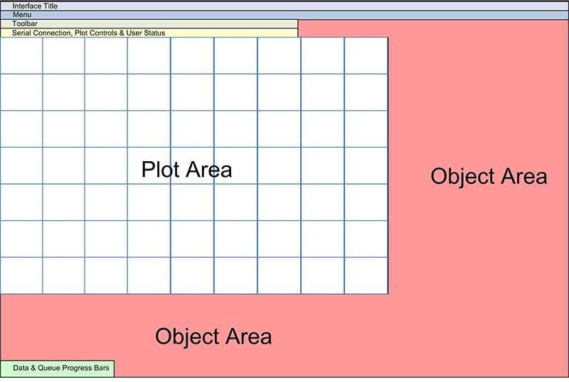
Figure 1. MakerPlot interface areas.
Line and bar graph plotting occurs in the plot area(s), while the object area(s) are where the controls are placed. In MakerPlot speak, controls are things like meters, buttons, switches, labels, sliders, text boxes, etc. At the very top are the drop-down menus, toolbar icons, and the connection and user status areas.
At the bottom are the real time data and queue progress bars that monitor the incoming data from your micro and from other sources like mouse clicks on the interface. So, that’s the general composition of the MakerPlot interface. However, for customization purposes, only the plot and object areas can be manipulated.
Creating a New Interface
Rather than start from scratch to develop a custom interface, let’s start with our standard interface (Figure 2) as it has a complete set of menu buttons and text boxes on the bottom, and a wide plot area.
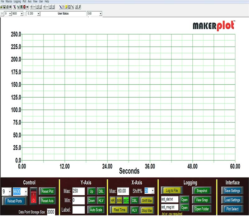
Figure 2. The standard interface.
What it doesn’t have are meters, sliders, and other controls that are usually on the right side. To make room for these other controls, we’ll need to adjust the plot area to expose more object area. Here’s how it’s done.
Referring to Figure 3, we need to save the standard interface under a different file name to keep it separate from our customization efforts.
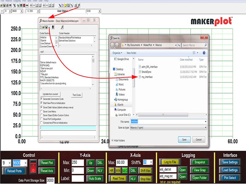
Figure 3. The Macro Builder.
To do this, click on the Macro Builder icon (it’s the one that looks like a wrench) and the Macro Builder drop-down menu will appear. Click on the Save As down arrow and save it under the new file name My_Interface.spm. Now, we can begin to experiment without affecting the standard interface.
In order to make room for other controls, we’ll need to reduce the size of the plot area. To do this, click on the Object Editor icon (it’s the one that looks like a hammer) and its drop-down menu will appear. In the Config tab, set the plot X and Y percentages to 80 and 80, which means 80% in both the X and Y directions for the plot area (Figure 4).
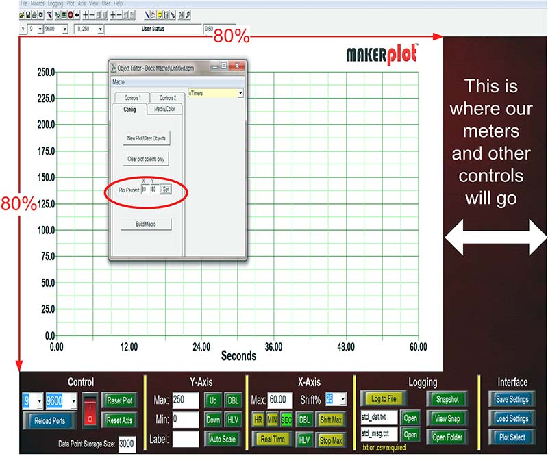
Figure 4. Setting plot area dimensions.
Now, there’s room on the right to place meters and other controls. Before we do this, let’s see how to change the background color from a dark red maroon to gold (Figure 5).
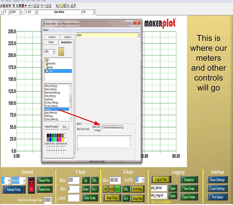
Figure 5. Changing the background color.
Using the Object Editor, click on the Media/Color tab and select oBack, which stands for Object Background. Next, click on the gold.jpg from the drop-down list and drag it to the rectangular area as shown. This will change the color of the Object Area background to gold. The choices of colors and background jpgs run the gamut, so you can select whatever suits your fancy.
Adding Meters
So far, so good. Now, let’s add two horizontal meters.
Referring to Figure 6, click on the Object Editor toolbar icon and click on the Controls 2 tab.
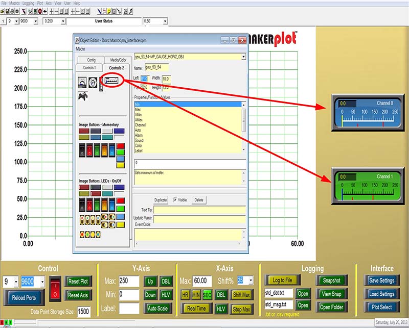
Figure 6. Adding two horizontal meters.
At the top, you’ll see four types of meters: square, round, vertical, and horizontal. Left-click and hold the mouse cursor on the horizontal meter and drag it to the top-right of the Object Area and release. This will coarsely position the meter.
Next, click on the Duplicate button in the Object Editor as this will bring up another instance of a horizontal meter.
You can reposition both meters separately using the keyboard arrow keys. You can also make changes to the meter’s background colors by using the Object Editor for that meter; we’ve chosen blue for the top meter and green for the bottom one to distinguish them from one another.
Finally, you can add minimum and maximum alarm settings (the little red marks under the meter scale), as well. When the analog signals that the meters are linked to go above or below these settings, an audio alarm will sound. Plus, you can change the type of audio alarm to know which meter is responding.
We’re purposely leaving out a lot of the placement, positioning, and other details to avoid boring you, but if you want to know exactly how all of this is done, then view the videos at www.makerplot.com → More → Videos → Maker → Adding Meters.
Adding Buttons and Switches
The next thing to do is to add some buttons and switches to control our meters.
For example, the meter scale now reads 0 to 250, but maybe our plot area’s Y scale is set at 0 to 1,000. Let’s add a momentary pushbutton below each meter to adjust the meter scale to the Y axis scale. This is done by selecting one of the Momentary Image Button icons and dragging it under the meter. Then, label it “Y Axis Adj.” When you click on this button, it will set the meter scale to the Y axis (Figure 7).
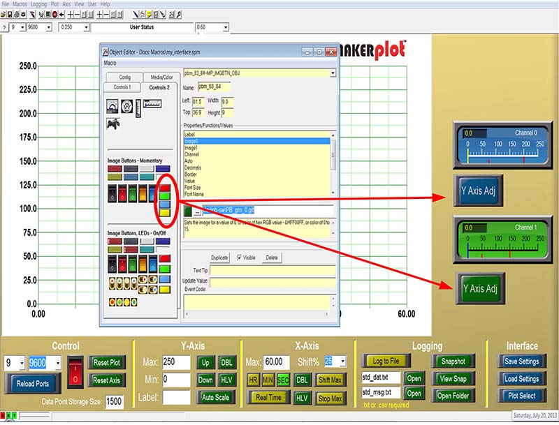
Figure 7. Adding Y axis adj buttons.
Recall that both of these meters have alarm settings and if the alarms are exceeded on either the high or low end, the meters will “beep” or sound whatever audio alarm you select for each of them. To mute the audio tones, we’ll add a slider switch to each meter so when the switch is ON, the tone will sound. When it’s OFF, it won’t.
It’s basically the same procedure: Left-click on the slider switch and drag it under the meter, then position it with the keyboard arrow keys like the Y axis switches (Figure 8).
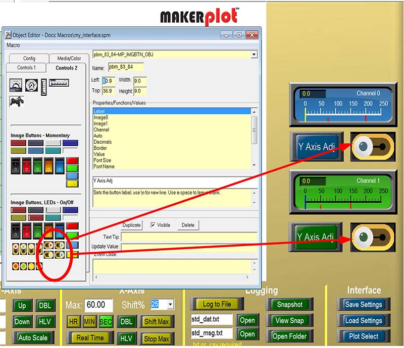
Figure 8. Adding meter alarm switches.
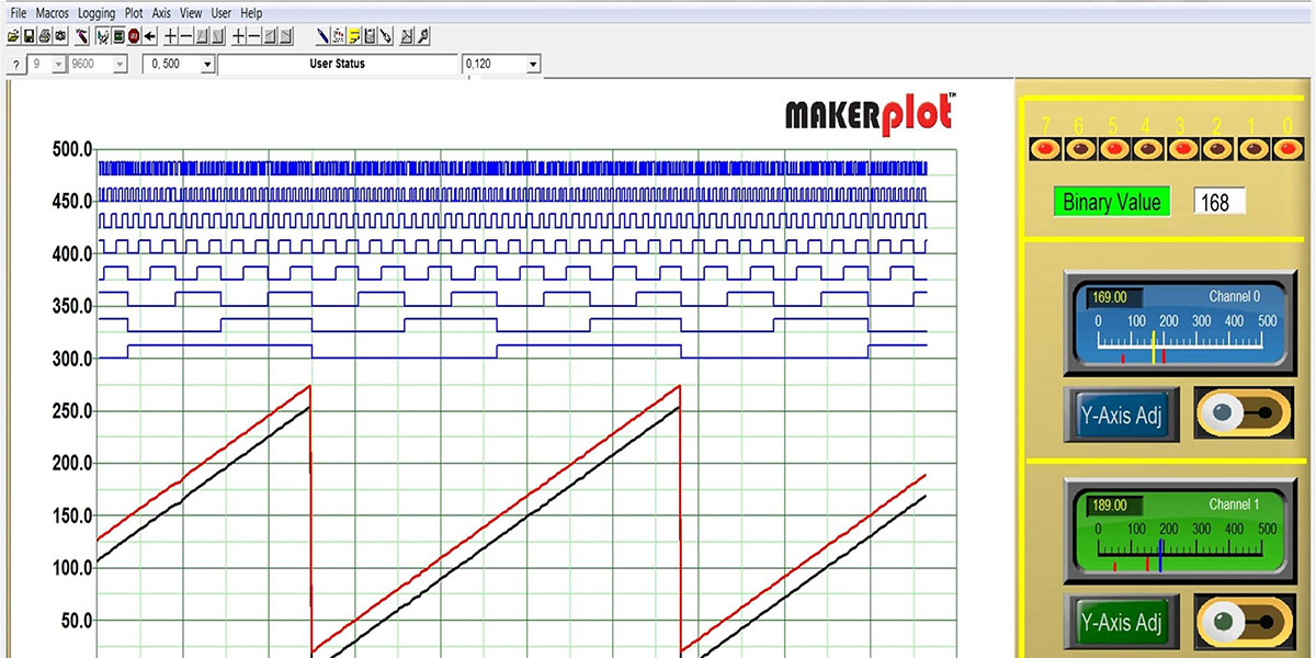
We’ve adjusted each meter to monitor a single analog channel, with the top meter set to analog Channel 1 and the bottom meter set to analog Channel 0. Now, when we begin plotting analog data again, these meters will display the levels of the analog signals.
Well, so much for analog signals. How about digital?
LEDs and More
For monitoring individual digital signals, LEDs are usually the choice. While MakerPlot is capable of displaying up to 32 separate digital signals, this example is limited to eight LEDs. Using the Object Editor again, we’ve clicked on and dragged a single red LED and placed it above the top meter. Then, we used the Duplicate button to create seven more. Finally, we arranged all of them in a row using the keyboard arrow keys; the result looks like Figure 9.
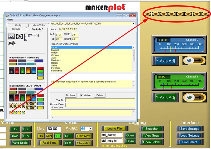
Figure 9. Adding LEDs.
Next, we labeled each LED with its corresponding binary weight from 7 (MSB) on the left to 0 (LSB) on the far right. This time, we switched to the Controls 1 tab to select the oLabel; using the Text Box in the drop-down menu, we set the numbers from 7 to 0 as in Figure 10.
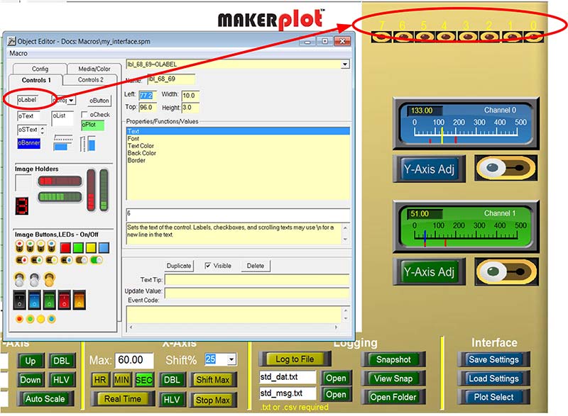
Figure 10. Adding LED labels.
That configures the individual LEDs, but we also want to see the numerical value of the eight digital signals, so that requires a Text Box. To do this, we grabbed an oText box and dragged it under the LEDs to display the numerical value (Figure 11).
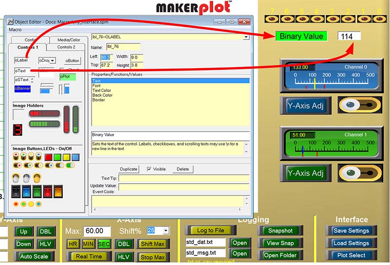
Figure 11. Adding the Binary Value.
Then, we dragged another oLabel and named it Binary Value.
So, that’s about it for the digital signals. Now, let’s add some window dressing to our customized Interface.
Dressing Things Up
While the meters and buttons for analog and digital signal monitoring are now on the My_Interface.spm, what remains is a way to finish things off. Let’s do that with some yellow vertical and horizontal borders. In our last example (Figure 11), we used an oLabel control as in Binary Value to label the oText box that displays the real time numerical value of the digital signals. As it turns out, we can use a similar oLabel control for horizontal and vertical boards, too; it just needs to be resized. As a matter of fact, the vertical yellow bars that separate the menu controls on the bottom are all really oLabel controls, so we’re going to use them as examples for vertical borders.
To do this, simply do a shift-right-click on any of the vertical bars and click the Duplicate button. This will bring up more of the same. Next, use the arrow keys to resize them and move them into place. The result should look like Figure 12 when complete.
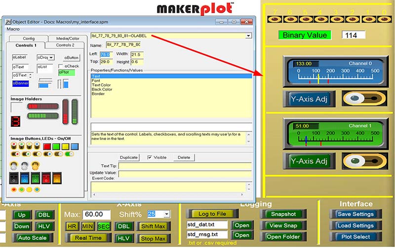
Figure 12. Adding borders.
You’ll notice that the meters, buttons, and switches are now bordered by the same horizontal and vertical bars as the menu area.
Saving Our Work
While the graphic part of the interface is complete, we’re not done yet. What remains is to save our work to the My_Interface.spm file. To start, you’ll need to click on the Macro Builder icon in the tool bar to bring up the Macro Builder drop-down menu (Figure 13).
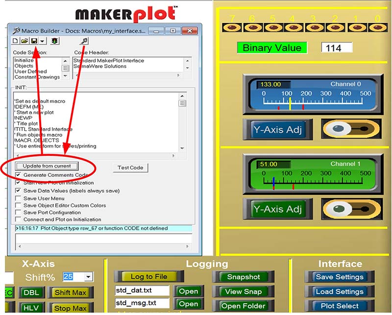
Figure 13. Saving our work.
Then, click on the Update from Current button that will load in all the graphic code for the meters, buttons, switches, labels, and text boxes that have been added. What’s left is to click on the traditional floppy disk icon to save our work to the My_Interface.spm file.
Conclusion
That about does it for building the graphics portion of our My_Interface.spm file. What still remains is adding MakerPlot instructions to the meters, switches, and text boxes in order to make these graphics do what we want them to do. We call these Event Codes. We’ll get into this in the next article because it’s just as important as the graphics we just showed you.
So, in review, you’ve been shown how to build a custom interface using the Object Editor and Macro Builder — two of the main building blocks of MakerPlot. Because of the details involved, we’re not going to go much further into how these two menus work in these articles, so, we invite you to find out more about them in our video. Just go to www.makerplot.com → More → Videos → Maker → Object Editor Parts 1 and 2 and Macro Builder.
Of course, all the details of everything about MakerPlot can be found in our MakerPlot Guide. By the end of this series, you will at least be aware of all the things you can accomplish yourself to customize MakerPlot; then it’s up to you to roll your own version.
That’s all for now, so just remember: Got Data – MakerPlot It! NV