Give your next project a modern look and feel with a touch screen display!
In the late 1960s, TV viewers were awed by the constellation of LEDs on the console of the Starship Enterprise. During the 1970s, any Hi-Fi worth its salt HAD to have seven-segment LEDs. By the 1990s, anything short of an LCD screen was considered passé. Welcome to the 21st century where touch screens are the standard by which products (and projects) are judged!
Early touch screens required copious amounts of processor memory. Programming was pixel by pixel and extremely memory-intensive (2 bytes (colors) x pixel-width x pixel-height; our small display = 153,600 bits = 38,400 bytes per screen!). As with most things, technology evolves; it’s simplified and eventually codified. Enter the Nextion family of touch screen displays. A current project of mine is just screaming for a touch screen, and research led me to the Nextion; primarily due to its built-in processor and simple-to-use IDE (integrated development environment). I thought I’d share this gem with my N&V friends.
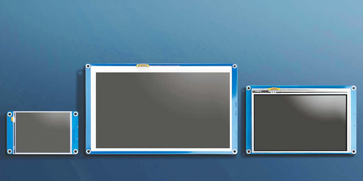
The Basic Nextion displays range in size from 2.4” (240x320 pixels) to 7.0” (800x480 pixels). For the first installment of this series, we’ll discover what it takes to put a basic screen together and get it to do things when we push virtual buttons. In follow-up articles, we’ll add a PIC processor to the mix using ME Labs’ PBP3 programming language, then later refine both ends for more advanced operation.
Initial Set-Up
To get started, you’ll need to download the IDE from https://nextion.tech/nextion-editor/. You can choose the .exe or zip version. Just follow the instructions (extremely conventional for installing new software). The Instruction Set can be found at https://nextion.itead.cc/resources/documents/instruction-set as well as with the downloads for this article. Patrick Martin (North American Nextion distributor) spent countless hours compiling the Instruction Set for our benefit.
With the IDE open, you can also access the Instruction Set from a tab on the screen. I went to the Instruction URL, selected All (Ctrl-A), copied (Ctrl-C), and then pasted (Ctrl-V) into a new Word document. This enabled me to print the document for easy reference.
Install the Nextion Editor and open it. You should see the Start screen (Figure 1).
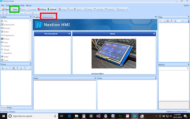
FIGURE 1. Nextion IDE Start screen.
You can access the Instruction Set by clicking on the Instructions tab (in red). You must be connected to the Internet for that.
To create a new project, click on the New button (in green; do that now if you’re following along). You’ll be asked to give it a name and find a home for it (Figure 2).
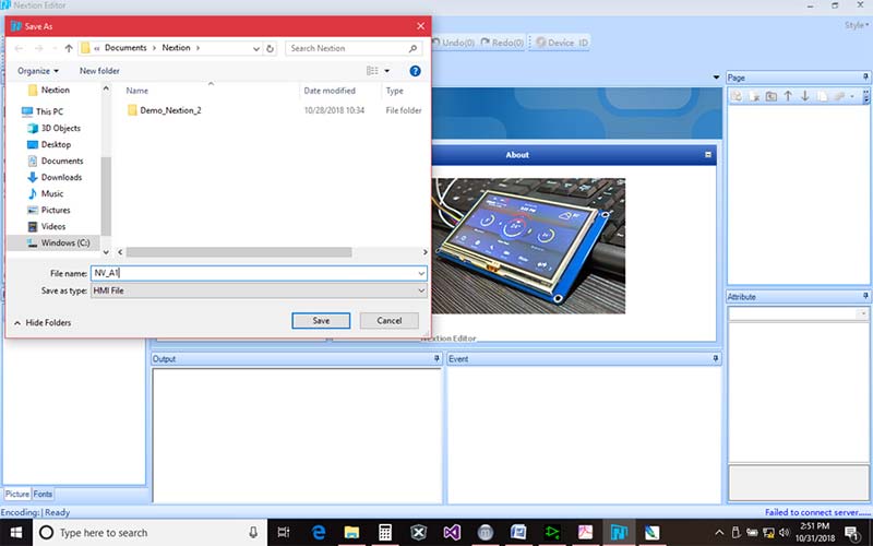
FIGURE 2. Creating a new project; “Save As” window.
Prices correspond to sizes, so for this first project, we’ll select the smallest (and cheapest) size: the NX3224T024_011 2.4” (240x320) screen (Figure 3).
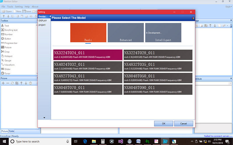
FIGURE 3. Select your Nextion part.
Next, in the top left corner of the pop-up window, select DISPLAY. Click on 90 Horizontal, then click OK at the bottom right (Figure 4).
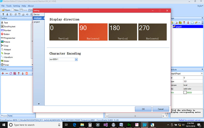
FIGURE 4. From DISPLAY, orient 90 degrees Horizontal.
You should see what is depicted in Figure 5.
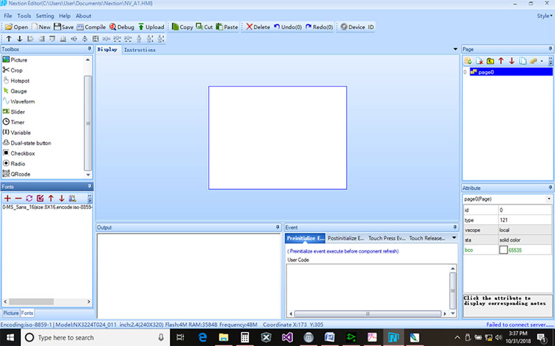
FIGURE 5. New project with a clean slate.
Hello World
At this point, we need to create a font that can be used with the objects we’ll be placing on the screen. In the top header is the button, Tools. Click on it and select Font Generator. The first entry in the pop-up is Height, which is the font size. By clicking on the drop-down arrow, you’ll see the sizes are in fixed increments (don’t try to enter your own value). To start, 16 is good enough.
The next selection is Code. It’s preset for North America. There are selections for Korean, Chinese, Greek, etc. For now, just leave that one alone. Third is a text box to select the font; the default is Microsoft Sans Se (Serif). We’ll use that one for now.
In the bottom right, call this font: MS_Sans_16. Click on Generate Font; it will ask you to give it a name (again) and a folder to save it to. Retype MS_Sans_16 and save it to a project folder of your choice.
When you click OK, a pop-up will announce Font Generate Finished: Size 3,615. When you click OK, it will ask if you want to add it to the current project; click Yes.
Finally, click the X (top right corner) to close the window. You should see your new font appear in the Font window (bottom left on your screen). We now have the bare essentials necessary to create a simple screen project.
In the Toolbox (upper left block), click on Button. A gray block will appear in the top left corner of the display area (center of the screen) with newtxt in the center and b0 (that’s “b” zero) in the top left corner of the button. The lower right screen window is labeled Attribute. You should see b0 selected.
Scroll down, find txt, and change it to Screen 2. Just below txt is txt_maxl. Our text contains eight characters, so change txt_maxl from 10 to 8. Entering the number of characters helps conserve memory. If your txt_maxl value is too small, you’ll get an error. Too large, and you’re wasting memory resources.
The upper right block is titled Page. Click on the leftmost icon (yellow folder with a green “+”) to add another page. You should see our button disappear and page1 appear in the page window. Click on Button in the Toolbox to add a button to this page. When it appears (it’s also called b0), use your mouse to drag it somewhere else on the page.
The lower right block lists the “attributes” for the selected object; in this case, the button (b0). So, bco will have a gray square and the number 48631. Click on the gray square and select the red option from the drop-down. The window should have a red square and the new number should be 63488; our button should now be red. Change txt to Screen 1 and again change txt_maxl to 8 (refer to Figure 6).
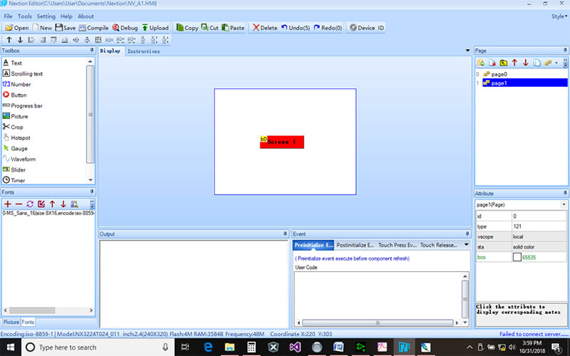
FIGURE 6. Page1 with Button b0 as per text.
From the Page window, select page0 (our first page). Click on b0 (the button). The Event screen (lower and right of center) offers two choices: Touch Press Event and Touch Release Event. Click on the Touch Release Event tab. Click on the User Code window and type in dp=1; dp will be in blue while =1 will be black. There are no spaces.
Switch back to page1 (top right Page window) and click on the red button. In Touch Release Event, type dp=0; dp is the code for Display Page (see Instruction Set).
In the Main header bar, click on Save, then Compile. To test our work, click on Debug in the Main header. A new window will appear with our page0 and gray button (Figure 7). Click on the gray button (Screen 2) and the next page1 should appear with our red button (Screen 1) showing. Click on it and page0 reappears. Click on them a couple times to get a feel for what’s happening.
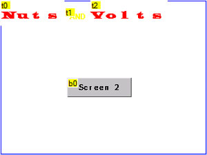
FIGURE 7. Debug screen at start.
Adding Components
The Toolbox shows several different tools that can be incorporated into your project. Let’s look at a few of them and build a more refined experiment that utilizes more of the Nextion capabilities.
To get started, in the Page block, click on page1 then the second icon in the Page block header (white folder with a red “X”) to delete page1. Using the Delete button from the Main header, click on the button (page0) and delete it. You should now have an empty page0 display.
Picture
Looking at the Instruction Set, pictures can be no larger than the display screen (in our case, 320x240 pixels). They must be formatted as 16-bit 565 color. Choices are jpeg/jpg, bmp, png, tiff, and non-animated gif.
Let’s create a splash image for our project. I’ll be using Photoshop, but any image editor should work. (You could either create a new Photoshop document, or resize an existing image.) The Gradient tool makes for a simple backdrop.
Create a new Photoshop document. Make it 16-bit RGB color, 100 dpi, 320 pixels wide and 240 pixels high. Select the Gradient tool from the Toolbar (right-click the bucket if that is shown to select the gradient tool). Choose a color (light colors are better). I selected a green. Next, draw from the bottom left towards the top right, stopping about two-thirds of the way. That’s it! Save it as Splash1.png (or something like that). Figure 8 shows the result.

FIGURE 8. Simple splash screen.
Going back to the Nextion Editor, select Picture from the bottom tab in the lower left block (it should say Fonts now). You should see Picture in the header for that block. Click on the + button. Find the Splash1.png we just made and select it. Click OK, OK. You should now see it in the Picture block.
From the Toolbox, click on Picture; p0 should now appear in the top left corner of your display screen. In the Attribute panel (lower right), double-click on the white space next to pic; click on the Splash1 image, then click OK. It should occupy the display area.
Now we can load components on top of it. If you put a splash screen over objects, the splash will cover and hide everything else. Add your splash screen first.
Text
Click on the Text tool from the Toolbox. You should see a text block displayed in the top left corner of the Display screen. Remember, the Button was labeled b0; the Text component is labeled t0.
In the Attribute block, ID is listed as 2. The Picture (p0) has an ID of 1. Each new tool you add is given an incremental ID number. This may become useful later when we need to talk to a processor.
Let’s create a new font. From the Main header, click on Tools, then select Font Generator. In the pop-up, set Height to 48, leave Code as-is, and select Wide Latin from the Font selector. Call it WideLatin_48 and save it. Of course, add it to the project when prompted.
In the Attribute block for t0, under txt, type NUTS (in all caps). Set txt_maxl to 4 (four characters in NUTS). Set bco to 65535 (pure white). Set pco to 63488 (red). Font should be 1. Your text block should show NUTS with the bottom somewhat cut off.
In the Attribute box, scroll down to the h selection and enter 40 (it’s 30 by default). Now you can see the whole word. For X, enter 60 to move it closer to the right.
Click on Text in the toolbar again; a new text object appears in the top left corner. From the Attribute window, change the following values: pco = 65504 (yellow), txt = AND, txt_maxl = 3, x = 160, and w = 40. You should now have a text object, t1, that’s yellow and reads AND. Click on the red NUTS txt object, then in Attribute, scroll down to the w value. You’ll see it’s 100 pixels wide. Click on the AND txt and scroll down to the x value and enter (100 wide + 60, for x = ) 160. For y, enter 10 to better align it with NUTS.
Click on Text in the Toolbar a third time to add another Text object. It will be called t2. In the Attribute window, put the following values: pco = 63488 (red), font = 1, txt = VOLTS, txt_maxl = 5, x = 200, y = 0, w = 120, h = 40.
Number
Numbers share much with Text in that the Attributes are very similar. Text objects are denoted as t0, t1, tx, while number objects are denoted as n0, n1, nx. Text is ASCII, while Number is a value.
Click on Number in the Toolbox to add a Number object. It will be n0. In the Attribute window, scroll down to length and change it to 2. Change value to 12. You’ll see 12 displayed in the n0 object.
Next, change length to 5. The object n0 now shows 00012. For value, enter 12345. It should be displayed. Next, change length back to 2. All you see is 45 — the Least Significant Digits of the entered value.
If you wish to display only a single digit with no leading zeros, the length attribute must be 1. For five digits, it must be 5, and so forth. Set length to 3.
As with the Text object, text color can be changed with the pco attribute; the background color can be changed with the bco attribute, etc.
Progress Bar
In the Toolbox, click on Progress bar. You’ll see an object appear in the top left corner of the Display screen called j0. Move your mouse over the right-most side of j0 until you see horizontal arrows; left-click and drag the right side to the right edge of the screen. Object j0 should now be as wide as the screen. (You could also change the w Attribute to 320.)
In the Attribute window, your h value should be 30. Considering our display height is 240, 240 – 30 = 210. Enter 210 in the Y value. The Progress Bar Object (j0) should now be at the bottom of the screen.
Timer
Click on Timer in the Toolbox. Notice a new bar appears in the middle of the screen with tm0. In the Attribute block, change the tim value to 500. Timer value is listed in milliseconds. We get 0.5 second processes with tim=500. In the Event block (bottom right of center), click in the User Code area. Type the following as it appears:
n0.val+=1//Increment n0
if(n0.val>100)//If n0 = 101 then
{
n0.val=0//Reset n0
}
j0.val=n0.val//Progress Bar = n0
From the Attribute block, select page0. In the Event block, you have four options to add code. The Preinitialize E... block should be selected. Type in the following:
n0.val=0//Start at zero
tm0.en=1//Enable Timer0
Notice there are no spaces in the commands. The double slash “//” starts Comments and is for your benefit only; it doesn’t become part of executable code.
From the Main header, click on Save, Compile, then Debug. The number should start at 000 and increment about twice per second. As it does, the Progress bar moves toward the right proportionally. When the Number reaches 100, it resets back to 0 and starts again. (See Figure 9.)
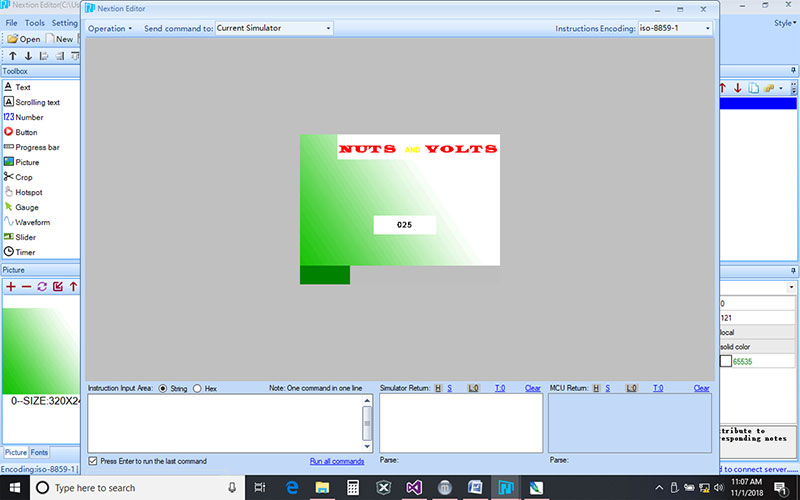
FIGURE 9. Number and Progress bar increment with Timer.
Gauge
Let’s add a gauge to our demo by clicking on Gauge in the Toolbox. It will be called z0. In the Attribute block, change y to 110. It should now be sitting on top of our Progress bar. In the Attribute window, click once on val and read the very bottom box: Angle,0-360. The Gauge range is 360 degrees. Select tm0 and add the following line of code:
z0.val=n0.val//Gauge = Number
Click Save, Compile, and Debug again. In this case, the Gauge only swings to about a quarter of the way before resetting. To properly express our Number better, we need a Variable.
Variable
Click on Variable in the Toolbar. It should show up next to our timer (tm0) in the middle of the bar and be labeled va0. Click on the timer and add the following code:
va0.val=n0.val*36//Var = n0 X 36
z0.val=va0.val/10//Gauge now reads 0-100%
Click Save, Compile, and Debug, and watch the gauge this time. Now it swings a full 360 degrees, tracking the Number and Progress bar (Figure 10).
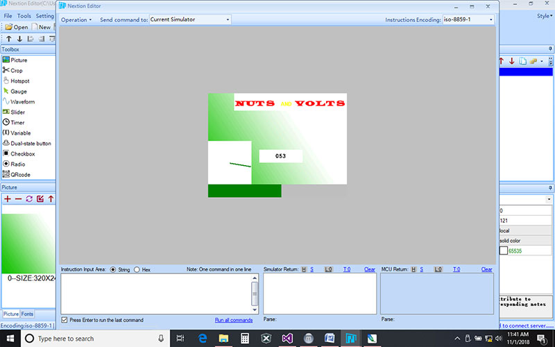
FIGURE 10. Added Gauge now reads properly.
Slider
From the Toolbar, add a Slider. It will be labeled h0. In the Attribute section, change y to 40 and w to 320. It should now be sitting under our NUTS AND VOLTS Text labels and take up the width of the display.
In the Event section, select Touch Move(0). In the User Code section add:
n0.val=h0.val
Next, click on the timer (tm0) in the middle bar (or select from the Attribute drop-down). Select and delete the first five lines (from n0.val+=1 to the second curly bracket }). Change the tim value to 100 in the Attribute section.
From the drop-down menu under Attribute, select page0 and add the following line of code in the Preinitialize... block in Events:
h0.val=0
Click Save, Compile, then Debug. With your mouse, slide the red block back and forth and watch what happens (Figure 11).
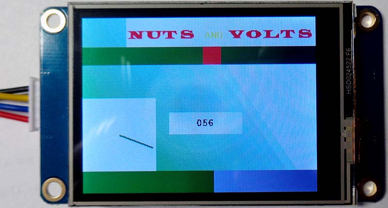
FIGURE 11. Number, Progress bar, and Gauge reflect Slider.
Instruction Set
You can access the Instruction Set by clicking on the Instructions tab just below the Main header on the Nextion website (https://nextion.tech) or in the article downloads. For now, there are a few things I wish to point out.
Under Section 1 — General Rules and Practices, No. 6 states “There are no spaces in parameters unless specifically stated.” Notice all our code used no spaces between object names and equal signs and values. No. 7 in conjunction with No. 12 explains why we had to add a variable (va0) to convert our Gauge to 0-100%. Read No. 17 for insight on the Attributes.
Section 2 — Assignment Statements offers details on using operators (+, =, *=, etc.). Note the difference between a single = and a double = =. No. 27 explains the use of Comments — anything after a double slash (//).
Section 3 — Operational Commands will come into play in the next article when we start talking to a PIC processor. However, No. 25 through 27 explain Blocks (if, for, while).
Section 4 — GUI Designing Commands covers commands that allow you to create shapes on the screen (there are none in the Toolbox).
I want to spend a little time on Section 5 — Color Code Constants. If you select a color in Photoshop, there are red, green, and blue values representing the chosen color that range from 0 to 255 decimals (or 0x00 to 0xFF hexadecimal). Windows 10 OS has a cool calculator with a Programmer mode (Figure 12).
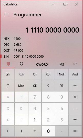
FIGURE 12. Windows 10 calculator in Programmer mode.
If you find a color you like, enter the red decimal value into your calculator (with Decimal selected) and look at the binary value it produces. Write it down. Do the same for green and blue. With 24 1s and 0s written down, grab the first five bits from your binary red value and write them down. Next, grab the first six bits (take note that green gets six bits) from the green binary value.
Finally, grab the first five bits from the blue. Clear your Programmer calculator, select Binary from the left margin, then enter all the 1s and 0s you assembled. If you enter the resultant decimal value into bco or pco in the Attribute section for any object, you’ll get a close approximation to the color you selected. This is mentioned in the Note section of Section 5.
For the green used in the Splash1 screen, Photoshop gave me: R=24, G=193, B=7. When we get the binary for these values (follow the above instructions), the final result is 7680 decimal. Entering that value into any object’s bco gives a close approximation of the green used (this value shown in Figure 12).
Section 6 — System Variables gives you the syntax to change page number, dim the display, put it to sleep (great for battery powered devices), wake it up, and other handy commands.
Finally, Section 7 — Format of Nextion Return Data explains the UART communication protocol we’ll need when we talk to our PIC processor in our next installment.
Summary
In this article, we downloaded the Nextion IDE Editing Software and loaded it with prefabbed objects. We checked our work in the simulator. I suggest playing with various “Attributes” to see what happens.
Be aware that pictures can initiate click events the same as buttons. This will be covered more thoroughly in a future installment.
If this article interests you, jump on Nextion’s website and read their tutorials, and perhaps even order one of their displays. Again, there is a ton of information online applying the Nextion to the Arduino.
In the next installment, we’ll be using an eight-bit PIC processor to add analog and digital inputs, as well as outputs we can control from the display. Then using UART, the two will talk nicely to each other. NV
Downloads
Nextion Instructions
HMI file
 download