In California, we’ve had a banner year for poor air quality with fires whose smoke has reached all the way to Michigan and fires from Oregon affecting the air quality here. There have been some days where the conditions were “unhealthy” and outdoor activities were limited.
Here’s a way to measure the Air Quality Index (AQI). I’ve made this as an extension to my Graphing Weather Station. Of course, you can extract the fundamental parts of my code and apply it to a small LCD display or a TFT display, and use a simpler Arduino. I find that seeing a graph over a period of time tells so much more than knowing the values for just a particular moment in time. I sometimes find surprises that have taken place when I wasn’t watching.
The standard for finding out the air quality is through the government at AirNow; www.airnow.gov. They use very expensive equipment which is labor intensive in its methods of measurement and not practical to use at home. A newer alternative is Purple Air; www2.purpleair.com. They make sensors that connect through the Internet to give readings that are very localized. While not as accurate as AirNow, the number of sensors is much greater, and may be more accurate for the average citizen unless you happen to be close to the government recording facility.
My measurements are based on the Adafruit Air Quality sensor (Adafruit #4632), made by Plantower (Figure 1).
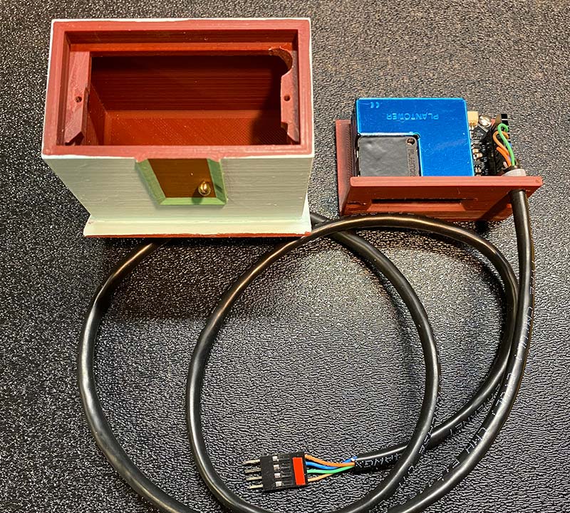
Figure 1: The AQI sensor mounted on its drawer, and the housing next to it.
It’s very similar to the sensor used in Purple Air devices, and the readings I get correlate very closely with someone’s Purple Air sensor two blocks away. It uses lasers to measure the light scattered off the air particles in a chamber fed by a fan pulling in the outside air.
It’s capable of measuring the air quality with a number of different parameters. I’m using the PM2.5 readings: micrograms of particles less than 2.5 microns in diameter per cubic meter of air. Larger particles are not as much a threat to our health since they can settle out of the air more easily and be filtered out more easily. Smaller particles are not usually present in quantities to threaten our health. Ozone and other chemical contaminants aren’t measured with this device, but particles of smoke and smog are of the largest concern to many of us.
The air quality is usually interpreted with the Air Quality Index, by applying computations to convert the PM2.5 data to the standardized format that has become familiar to us. This standardized format groups every 50 units into categories of hazard, with a color to represent the hazard.
| Air Quality Index ILo to IHi |
Description of Hazard |
Color |
PM2.5 - PLo to PHi |
| 0-50 |
Good |
Green |
0-12.0 |
| 51,100 |
Moderate |
Yellow |
12.1-35.4 |
| 101-150 |
Unhealthy for Sensitive Individuals |
Orange |
35.5-55.4 |
| 151-200 |
Unhealthy |
Red |
55.5-150.4 |
| 201-300 |
Very Unhealthy |
Purple |
150.5-250.4 |
| 301-500 |
Hazardous |
Maroon |
250.5-500.4 |
Notice that the conversion is not linear, and each range of AQI corresponds to an entirely different range of PM2.5 sensor readings. The proportions of conversion change for each range, and go by the following formula:
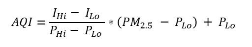
Where AQI is the resulting Air Quality Index, PM2.5 is the reading from the sensor, and the other values are from the table. I converted the sensor reading using this formula in the GetAqiCalcValue() function in the code. In the function GetAqiColor() the color is determined that goes with a given AQI value.
Electronics
Most of the electronics involved are already taken care of in the central unit of the Graphing Weather Station. The Air Quality Sensor communicates by I2C. I ran the four lines (5V, Ground, Data, Clock; Figure 2) from the PCB (printed circuit board) out a hole in the back of the unit, through a hole in the wall, to the sensor outside a window.
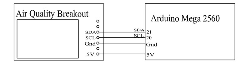
Figure 2: The circuit diagram for connection to the Graphing Weather Station.
You could also mount the sensor on top of the mast with the other weather measurement devices since the required four lines are available there, but I was afraid that when the wind reaches high strength (50 mph around here sometimes) and the mast leans over in the wind, water from the rain may blow up into the fan and electronics and ruin the sensor.
Also, the AQI sensor requires current to continuously run the tiny fan in it, and I had concerns that sucking up this current at the top of the mast might compromise the current available to the other instruments up there. When it’s on its own circuit outside the window, the current needs are somewhat independent of the other instruments. The sampling of air quality can be done just as well outside a window in more protected areas, but does require a separate cable. Figure 3 shows the fan opening at the underside of the assembled enclosure
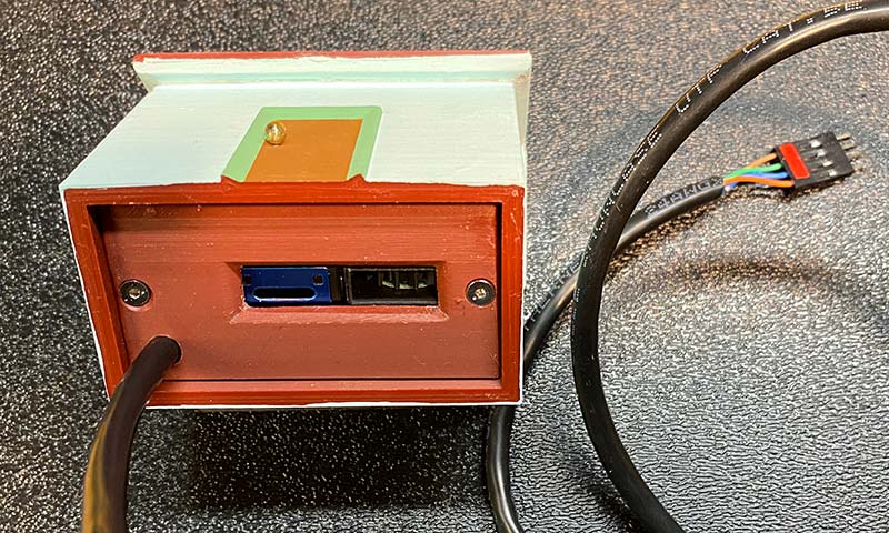
Figure 3: The complete exterior unit, showing the opening for the air quality to be sampled.
The sensor and its associated breakout circuit board are mounted on a 3D printed platform that slides into its weather protective housing. The remainder of the enclosure keeps insects and spiders out. I’m hoping that the fan will discourage them from entering the measurement opening, but anticipate having to blow some air into it now and then if the critters do decide to enter.
The housing is also 3D printed and then painted to look like a house (Figure 4).
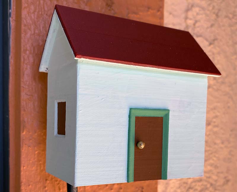
Figure 4: The complete unit installed outside a window.
If it looks “cute,” I find that my wife is happier about having an electronic gadget outside the window where our visitors can see it.
I connected the sensor with a piece of Ethernet cable. Inside the sensor housing, I used header connectors, but if I were doing it again I would just solder the wires from the cable straight to holes in the sensor’s circuit board. Mounting the sensor is fairly flexible; the main requirements being that the rain can’t get into the sensor. The opening to the sensor should not be blocked or screened, so that there’s no restriction to the sensor’s access to the air.
Interpretation of the Data
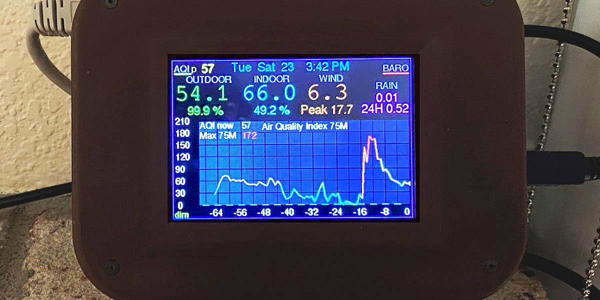
I made two different ways of recording the data. First, by taking readings every two minutes, then every 20 minutes it records the average of the 10 readings. This is the method used by Purple Air, and gives a graph over the last 24 hours. The upper left of the display has “AQI” followed by a dimly colored “a” (for average), and then the current average reading. The reading and the underline under the “AQI” is in the color corresponding to the category of hazard level.
When this area of the screen is touched, the graph shows the 24 hour graph, and the lines of the graph change to the color corresponding to the data values. Figure 5 shows a day where the pollutants went into the red zone, and then the rain started about noon and the air quality did a dramatic turn for the better.
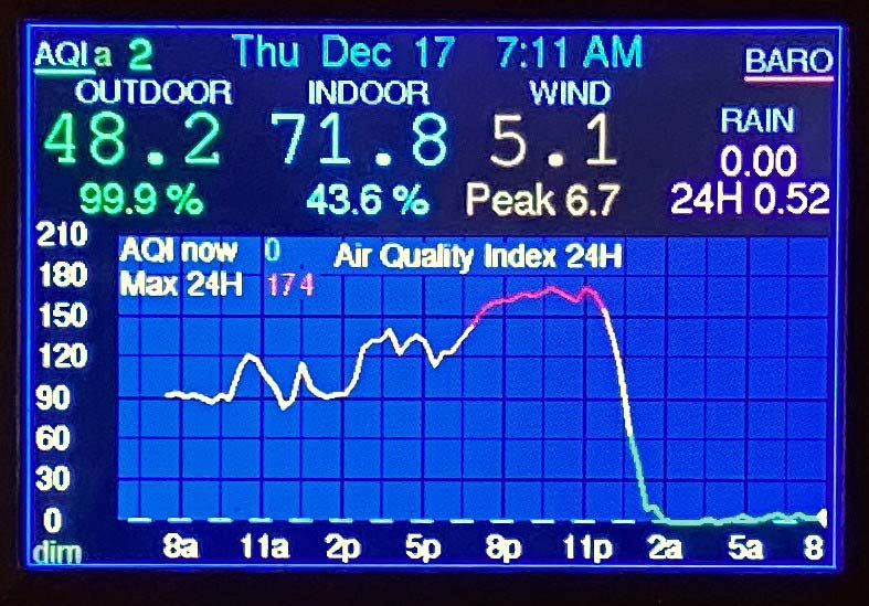
Figure 5: A day’s measurement; smoky air changing to clear air with the start of some rain.
When the data crosses from one color to the next, the color goes with the latest reading. On a day with big changes in readings, the graph becomes quite colorful! The camera could not adequately record the vividness of the colors or the clarity of the display.
When the upper left of the display is touched again while the graph is displaying Air Quality, the display converts to peak values over the last 75 minutes. The AQI at the top left of the screen has a dimly colored “p” next to it (for “peak”), followed by the current peak reading. The graph now shows the last 75 minutes of peak values. The air quality is measured every 10 seconds, and every minute the peak value of those six values is added to the graph.
For fun, I brought it inside and on peak value mode, I watched the graph after lighting a paper match, and then later lighting an incense match (Figure 6).
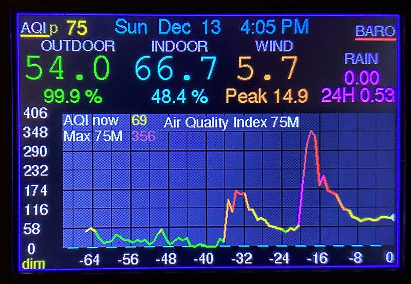
Figure 6: Peak value measurement of indoor air, with lighting a match at -36 minutes and lighting an incense match at -20 minutes.
The paper match pushed the air quality into the red “unhealthy” zone and the incense match put it through the purple “unhealthy” zone and right into the maroon “hazardous” area! Thank goodness the air quality recovered after a while.
Touching the AQI label at the upper left of the screen changes the graph from a different weather function (temperature, wind, etc.) to graphing air quality. While displaying air quality, touching the AQI changes from average mode to peak mode, and back again. When you leave the AQI graph, the mode remains in average or peak — whatever it was last set to. The data buffer is the same for both modes, and the graph will display all the data regardless of which program was being used.
The time period displayed may not be correct for the data previously recorded. For example: If it was set on average and then you change it to peak, the horizontal graph labels will go to 75 minutes in the past, and 24 hours ago will look like 75 minutes ago. After the peak program has been running for 75 minutes, all the old data will run off the screen and the labels will be correct.
I find it fascinating to see the changes in air quality over the course of time. It can be cruising along nicely at a good level, then all of a sudden spike up. Maybe a bus went by, a barbeque started up, or it was caused by some other mysterious reason. NV
More Information
- “The Graphing Weather Station,” Nuts & Volts Magazine, Issue 1, 2020.
- Purple Air: www2.purpleair.com.
- AirNow: www.airnow.gov, with information, and my source for the formulas for data conversion.
- The the Arduino code for the Weather station, updated with Air Quality Index measurement; the stl files for 3D printing the housing for the outside sensor; modified library files for this project and instructions for their use; and the ExpressPCB designed printed circuit board for the Weather Station with connections added for the sensor. Since I added the sensor to an already complete weather station, I just drilled some small holes in the PCB for the original station and wired the four connections with point-to-point wiring.
- My website at www.chaneyproductions.com/vics-creations has a little more information, as well as updates.
- You’re welcome to contact me at [email protected].
Downloads
What’s In The Zip?
Arduino code for the Weather station, updated with Air Quality Index measurement; the stl files for 3D printing the housing for the outside sensor; modified library files for this project and instructions for their use; and the ExpressPCB designed printed circuit board for the Weather Station with connections added for the sensor.