This strange-looking chart turns the complex mathematics of transmission lines into circles and arcs that unlock the mysteries of SWR, stubs, matching networks, and a whole lot more.
The ways and means of transmission lines can be mysterious as you may remember from the January 2016 Ham’s Wireless Workbench. The key to unraveling such mysteries is often having the information presented in a new way — perhaps an analogy or a picture that explains what’s happening “inside the line” in a new and different manner. For many hams, the magic window is a novel and useful type of graph called a Smith chart.
Smith Chart Background
First described by Phillip Smith in 1939, there are a number of QST articles and a detailed Wikipedia page (en.wikipedia.org/wiki/Smith_chart) on the Smith Chart. They provide as much background as you care to absorb, and deeper discussions than this article can provide. You can read these articles first or use them as references throughout this article. The ARRL has made the QST articles available for downloading at www.arrl.org/smith-chart.
Where Does the Smith Chart Come From?
Before discussing the chart, let’s back up a step. All impedances consist of resistance and reactance. Graphically, these components are represented as a pair of axes at right angles, as in Figure 1.
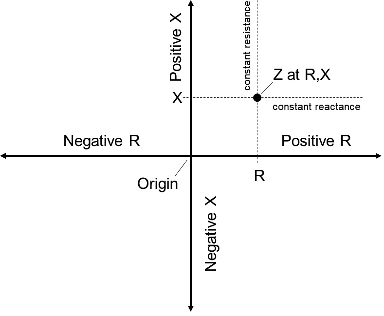
FIGURE 1. This graph shows the rectangular coordinates for any impedance. The X axis represents resistance (R) and the Y axis represents reactance (X). Inductive reactance is positive (+Y axis) and capacitive reactance is negative (-Y axis). Positive resistance which represents loss is on the positive X axis.
The horizontal axis represents resistance (R): positive to the right of the origin and negative to the left. The vertical axis represents reactance (X): positive (inductive) above the origin and negative (capacitive) below. R and X are the rectangular coordinates of the impedance. Hold that thought.
In a transmission line, when a wave of RF voltage and current encounters an impedance different from the characteristic impedance of the transmission line, Z0, some of the energy in the wave is reflected back towards the wave’s source. The phase of the voltage and currents making up the reflected wave will differ from those in the incoming or incident wave depending on the value of the impedance causing the reflection.
The incident and reflected voltage and current waves combine at every point along the line. At each point, the combination results in voltage and current with a phase relationship different from either the incident or reflected waves. It is as if the same energy in the line had been applied to an impedance with values of resistance and reactance that create the same phase relationship. If you cut the line at that point and replace the section beyond the cut with actual components of the equivalent impedance, there would be no change to the waves in the remaining section of the line!
The voltages and currents of both waves also vary with distance along the line because of the AC nature of the waves. This results in different combinations of incident and reflected voltages and currents and their equivalent impedance. For example, if the equivalent impedance looks like 5Ω of resistance and +20Ω of reactance at one point, a bit farther along the line the equivalent impedance might be 20Ω of resistance and -5Ω of reactance. That means the point on the graph of resistance and reactance also moves around with position in the line, returning to its original position every half-wavelength (1/2λ) as it turns out.
Smith Chart Construction
The equation describing how that impedance point moves around on a graph of rectangular coordinates is pretty intimidating:
Z = ZO [ (ZL + j ZO tan (βl)) / (ZO + j ZL tan (βl)) ]
and the path it describes on a rectangular graph does not lend itself to easy use. (βl gives the electrical position along the line.) What Smith discovered, however, was that if you distort the rectangular graph in a certain way (called a mapping), the path of Z along the line becomes a circle on the distorted graph. This is a lot easier to work with!
What is this magic mapping? Imagine yourself standing on the origin of the rectangular graph with the positive resistance axis in front of you and the negative behind. The positive reactance axis starts at your feet and goes straight up and the negative straight down. All of the axes extend to infinity.
Now imagine reaching up over your head and bending the positive reactance axis down in front of you (make your favorite bending noise) in a semicircle whose far end meets up with the far end of the positive resistance axis. Do the same for the negative reactance axis, bending it up instead. The negative resistance axis still extends behind you, as straight as ever. This process is sketched in Figure 2.
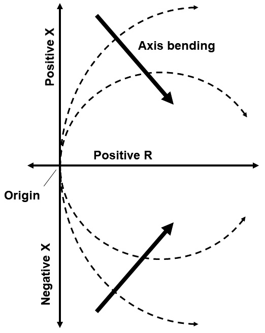
FIGURE 2. Distorting or mapping the rectangular coordinate graph by bending the Y axis toward the positive X axis captures all of its right-hand side impedances inside the circle formed by the bent reactance axes. This is the basis of the Smith Chart.
Viewed from the side, you see a circle created from the two reactance axes, bisected by the resistance axis. The infinity points of all three join together at the right of the chart. All of the points that were once in the right-hand side of the rectangular graph are now somewhere inside or on the boundary of that circle. Points on the left-hand side of the rectangular graph are now outside the circle.
What is Negative Resistance?
You can’t go to an electronics parts store and buy a negative resistor, but negative resistance isn’t that unusual. Ordinary positive resistance follows Ohm’s Law in which voltage and current increase together and consume power, dissipating it as heat or doing some kind of physical work.
Instead of consuming power, a negative resistance can generate power — even amplify a signal. Negative resistance is usually found in nonlinear electronic components that have a resistance which varies between positive and negative regions as current through the component varies. A good example of such a device is a Gunn diode which is used in oscillators at the heart of portable radars.
Gas discharge tubes like neon lamps also show negative resistance, acting like a very high positive resistance at low voltages but then switching to negative resistance when the gas breaks down and conducts. Negative resistances can’t be created inside transmission lines, so the Smith Chart only covers the right half of the impedance graph.
Nothing has been lost, just squashed or stretched. The Smith Chart ignores everything outside the circle because those points have negative resistance values and cannot be present in a transmission line.
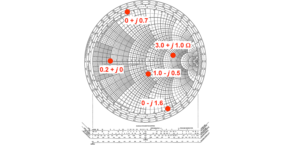
The straight lines on the rectangular graph after remapping are now circles and arcs on the Smith Chart in Figure 3. Lines of constant resistance — originally vertical and on which all points had the same value of resistance — are now nested constant-resistance circles that come together at the far right of the Smith Chart.
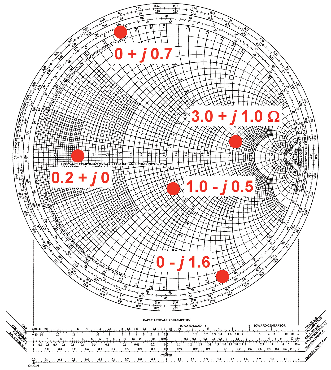
FIGURE 3. Several impedance values are plotted on the Smith Chart; 0.2 + j0 is on the center axis at the point labeled 0.2. The value 3.0 + j1.0 is found by locating the value 3.0 on the center axis, then moving upward along the constant resistance circle to the arc labeled 1.0 on the outer circle. To find the value 1.0 — j0.5, start at the point labeled 1.0 on the center axis and move down to the arc labeled 0.5 on the outer circle; 0 + j0.7 and 0 — j1.6 are located on the outer circle where resistance is 0.
That should make sense because all those straight lines originally went where? To infinity — now the point at the right side of the Smith Chart. Horizontal constant-resistance lines of points having the same reactance are now bent into constant-reactance arcs with one end on the outer circle (the original vertical reactance axes) and the other end at ... yes, that’s right ... infinity (but not beyond)!
Plotting Points on the Smith Chart
An impedance of R + j X is plotted at the intersection of the constant resistance circle with a value of R and the constant reactance arc with a value of X. R values for the constant resistance circles are labeled along the center axis. X values for constant reactance arcs are labeled around the outer circle with positive values along the top half of the circle. In Figure 3, several points are plotted as an example.
Most RF feed lines and antenna systems are designed to work with impedances of 50Ω. If you look for the point of 50Ω of R and 0 X, you will find it squashed way over in the nest of circles at the right-hand side of the chart — not very easy to use. Smith avoided this problem by normalizing all the coordinates to the characteristic impedance of the line, ZO. Normalization replaces the values of all points by their ratio to ZO; in this case, dividing them by 50Ω. An impedance of 50 + j 0 Ω is right in the middle of the chart at 1.0 + j 0.
The Half Wavelength Circle
The value for Z given in the equation above repeats when βl changes by 1/2λ. On a Smith Chart, this means the value for Z will be in the same spot every 1/2λ along the line. You can see that in the outer circle’s calibration marks, which are in fractions of a wavelength. Each circuit around the chart corresponds to moving 1/2λ (electrically) along the line.
You can see how this works by plotting the circle for yourself. You’ll need an SWR analyzer (or impedance meter or network analyzer) that shows both resistance (R) and reactance (X) values. It doesn’t need to show the sign of the reactance.
Start with a 10 meter long piece of 50Ω RG-58 (any solid-polyethylene 50Ω line will do). This is approximately one electrical half wavelength long at 10 MHz. Put a coax connector on one end, short the other end, and use your analyzer to find the lowest frequency at which the meter shows zero or a minimum value of X. That is the frequency at which the line is electrically 1/2λ long.
Note this frequency. Replace the short with a 150Ω resistor. Your meter should now show an SWR of 3:1 and the impedance at the analyzer should be 150Ω of R and 0 X. On the Smith Chart, this point is at (150 + j 0) / 50 = 3.0 + j 0, on the horizontal axis to the right of center.
Increase the frequency in 0.5 MHz steps, recording R and X at each step and plotting the normalized values on the Smith Chart. Because you may not know the sign of the reactance, assume the reactance values become negative (capacitive) as you increase frequency.
Stop when you see the reactance go to zero again; halfway around the chart near 50/3 = 16.6Ω, plotted as 0.33 on the horizontal axis. This is the frequency at which the line is 3/4λ long — approximately 13.3 MHz. While you’re recording the points, note that the SWR reading doesn’t change.
The points you have plotted should form a semicircle with its lowest point at approximately 0.6Ω of R and –0.8Ω of X. (This is an un-normalized impedance of 30 – j40 Ω.) Continue increasing the frequency until the points return to the horizontal axis near the 3.0 mark at which you started. The line is now 1λ long and the frequency should be twice what it was when you started.
The complete circle of points is called a constant-SWR circle because all the points on that circle cause the same SWR. (If you dare, plot the points on a rectangular graph — which would you rather work with?)
Free Admittance!
Impedance, however, is not the only way to work with voltage and current in a transmission line. Admittance (Y) is the reciprocal of impedance; Y = 1/Z. Similarly, admittance is made up of conductance (G) and susceptance (B), which are both in units of siemens (S). G and B are the reciprocals of their counterparts in the impedance world; G = 1/R and j B = –j / X. (Note that 1 / j = –j.) Impedance is sufficient for most problems, but admittance comes in very handy at times. For example, admittances in parallel add together, just as impedances in series add together.
To create an admittance version from a “regular” impedance Smith Chart, first flip the chart horizontally about a vertical line drawn through the center of the chart. That changes all of the constant-resistance circles, touching at the right-hand side of the resistance axis (where R = ∞ and G = 0), into constant-conductance circles that touch at the left-hand side of the axis (where G = ∞ and R = 0). All the constant-susceptance arcs still start on the circle’s outer rim, but now meet at the left-hand side of the horizontal axis at G = ∞; just as the constant-reactance arcs met at R = ∞.
Now flip the chart vertically about a horizontal axis through the center of the chart. This accomplishes the final part of the transformation, adding the effect of the minus sign in the equation j B = –j / X.
Many problems in transmission lines are worked out using a combination of Z and Y. Some parts of the problem are easiest working with Z, while others are easiest using Y. It would be awfully inconvenient to use two separate charts for this, so engineers did the logical thing and printed both sets of coordinates on a single chart!
The result would be hopelessly cluttered except that some bright person decided to use two different colors. A sample is downloadable at www.dartmouth.edu/~sullivan/colorsmith.pdf. The admittance coordinates are in blue and the impedance coordinates in red.
Look carefully at the labels on the outer circle axis near the left-hand side of the chart. You’ll see that the top label, for example, is “Inductive Reactive Component (+jX/ZO), or Capacitive Susceptance (+jB/YO).” Susceptance is normalized (just like reactance) by dividing it by the characteristic admittance (YO = 1/ZO) of the transmission line. If ZO = 50Ω, then YO = 0.02S.
Trivia Night
When you’re out with the other electronic-ers, you can impress them by knowing the answer to:
What single point is the same on both types of Smith Charts?
That’s right — 1.0 + j0 at the very center. That is the only complex number whose reciprocal is the same as the original number!
Putting the Smith Chart to Work
The Smith Chart is a great tool for working out all kinds of problems involving impedances, admittances, and transmission lines. One of the most common is impedance matching. (See the Ham’s Wireless Workbench on that subject.) The Smith chart is a guide to how those transformations can be made using Ls and Cs by moving along the various circles and arcs to the desired impedance, such as the normalized 1.0 + j 0. But what does “moving” on the Smith chart mean?
There are two simple rules for making the “allowed moves.”
Rule 1: Every component is treated as a pure R, L, or C.
Rule 2: When adding components in series, treat them as impedances and use the red impedance coordinates. When adding components in parallel, treat them as admittances and use the blue admittance coordinates. The result is that you’ll be making “moves” on the chart along the arcs and circles — much like a rook in chess has to move along the ranks and files.
Some practice moves are illustrated in Figure 4. On the dual-coordinate chart, find point A: Z = 150 + j0Ω. Normalized to 50Ω, that is Z = 3.0 + j0Ω. (From here on, we’ll work in normalized coordinates and the pre-normalized values will be shown in parentheses where necessary.)
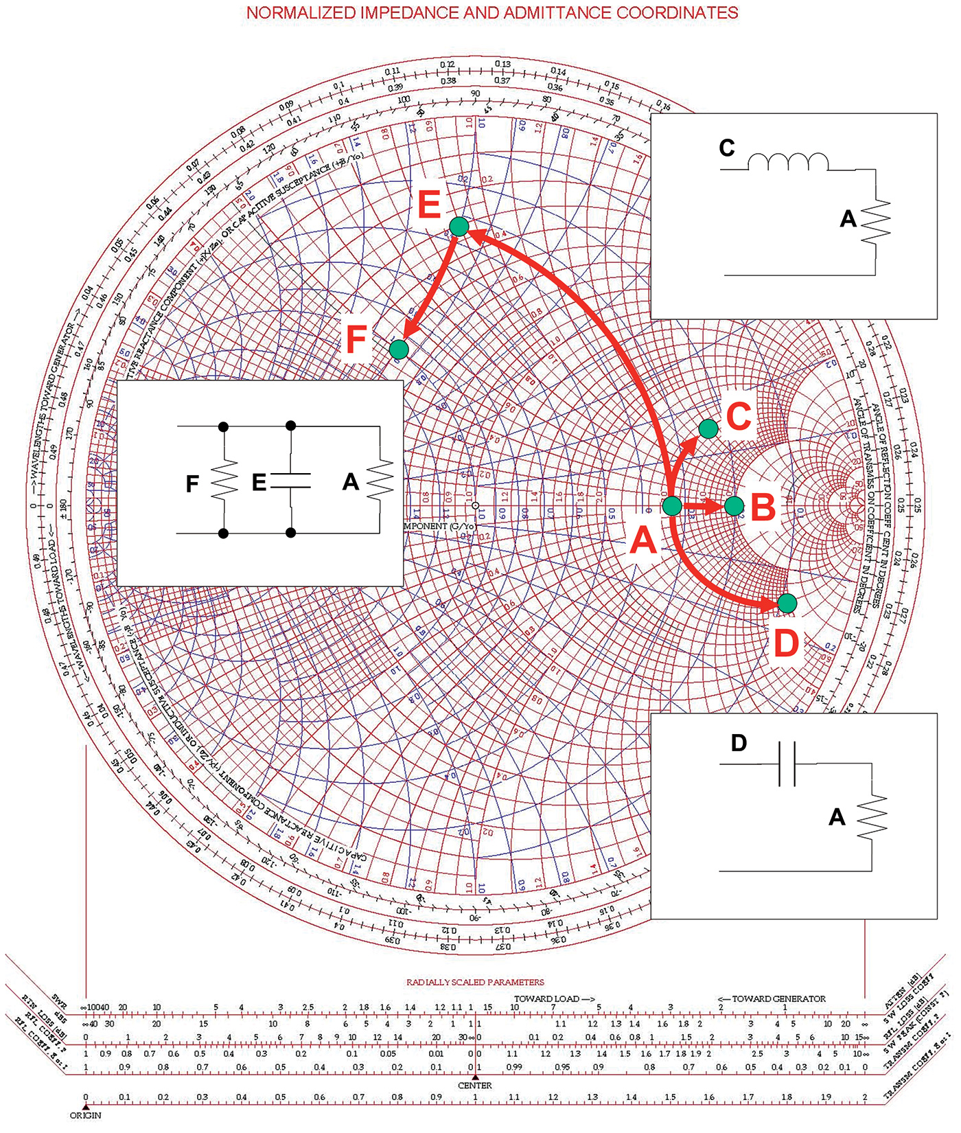
FIGURE 4. Beginning with Point A (3.0 + j0) representing a resistance of 150 ohms, the effect of adding series and parallel components is shown by the red arrows. See text for discussion.
Add 2.0Ω (100Ω) in series with the impedance at Point A. Following Rule 2, this is a series combination, so we’ll treat the extra 2.0Ω as an impedance and add it to the original impedance for a final value of 5.0 + j0Ω (250 + j0Ω).
On the chart, this move has to be along a red constant-X arc. Why? Because adding R in series does not change X. Point A lies on the constant-X arc representing X = 0 (the horizontal axis), so adding 2.0Ω of R moves to 5.0 + j0Ω at Point B, also on the X = 0 constant-X arc.
What if instead of series resistance, we added some series reactance? Rule 2 would still apply, but now we’d move along a constant-R circle because we’re only changing X. Point C is the result of adding +j2.0Ω (100Ω) of inductive reactance in series with 3.0Ω.
The arrow moves along the constant-R circle labeled “3.0” at the horizontal axis until it encounters the constant-X arc labeled “2.0” at the outer edge of the chart in the inductive reactance (upper) half of the circle. The circuit inset shows the addition of the capacitance (C) to the original impedance (A).
Let’s add series capacitance instead. Point D is the result of adding –j6.0Ω of capacitive reactance in series with 3.0Ω. Once again, the arrow moves along the constant-R circle labeled “3.0,” this time in the lower half of the chart until it encounters the constant-X arc labeled “6.0.” The inset circuit shows how the impedances are connected.
What if we add a component in parallel with our original 150Ω? Again, according to Rule 2, we treat both components as admittances, so let’s start by converting 3.0 + j0Ω to admittance = 0.33 + j0S which is ... the same point!
That’s a handy thing to remember: A pure resistance and its equivalent conductance are at the same point on the horizontal axis of both the impedance and admittance coordinates.
Let’s add a capacitor with j1.0S of capacitive susceptance in parallel to get a combined admittance (remember, they just add together) of 0.33 + j1.0S. Travel along a constant-G circle (because the conductance was not changed) at 0.33S (between the 0.3 and 0.4S circles) to the constant-B arc labeled “1.0.” This point is shown at E in the figure.
Now, add 0.67S of conductance, also in parallel. This moves the point along a constant-B arc to the constant-G circle with a value of 0.33 + 0.67 = 1.0S. The result is the Point F at 1.0 + j1.0S as shown in the inset circuit.
SimSmith: An Online Charting Tool
You might be sweating a little bit and that’s pretty normal for a first encounter of the Smith Chart kind! While a lot of eraser crumbs and compass pencils got worn down designing circuits and antenna systems this way, there are online versions that do a lot of the hard work for you.
The best one I know is the free SimSmith program by Ward Harriman AE6TY, available at harriman.ddns.net/Smith_Charts.html. Figure 5 shows a typical screen.

FIGURE 5. A typical screenshot from the SimSmith software by Ward Harriman AE6TY. SimSmith allows the user to build arbitrarily complex combinations of components and transmission lines, showing the behavior of the system with frequency.
You can build up systems of transmission lines, including stubs, plus lumped-L and -C and -R components, S-parameter blocks, and even arbitrary circuits described by data files. There’s an active user’s group and a number of great tutorials by Larry Benko WØQE. It’s a terrific resource.
I hope you enjoyed this introduction to the Smith Chart. It’s an amazing tool that brings the arcane math of transmission lines to visual life so you can understand them. NV